How to dock different wallpapers on the wall. Combining wallpaper in the interior - original ways and techniques. Colors and prints
If you decide to wallpaper different types in one room, then you should first consult with the designers. Almost before every repair, when the question of wall decoration comes up, the option of combining wallpaper is considered. This option is especially considered if we are talking about renovating the living room. I would like to highlight the main wall, make it accent, setting a certain tone for the entire renovation, adjusting the appearance of the main room in the apartment. But is this task so simple - combining wallpapers? How to do it beautifully and efficiently, what ideas and methods are currently relevant?
Combination rules: how to glue wallpaper of two types
Knowing the theory in this matter will not be superfluous at all. For example, there are moments from which you need to build on. One of them is the height of the ceiling. Based on this characteristic, you should choose a pattern, determine the color of the wallpaper and their texture. If the ceiling is low, not higher than 2.5 m, then you need wallpaper in light colors, with a medium-sized pattern, without a rough texture. And if the ceilings are even lower, then the main background of the wallpaper should be light with a faintly pronounced pattern, and vertical stripes can be located on one of the walls.

The wallpaper in the room should be harmoniously combined in texture and shade.
High ceilings - a reason to glue a completely different wallpaper. Here you already need a large drawing, which is stretched in width. You can also divide the walls horizontally, using the top and bottom half different colors. Horizontal stripes will visually expand the room.
The next point is the size of the room:
- In small rooms it is correct to use only bright hues if the wallpaper has a texture, then it is weakly expressed, if there is a pattern, then it is not large;
- The second point is the geometry of the room, if the room is narrow and long, you just need combined gluing, they glue it on short walls light wallpaper, some of which, as it were, go around the corner;
- If the entrance to the room falls on one of the narrow long sides, then the middle of the opposite wall is highlighted in a different color, and the corners are pasted over with wallpaper for short walls.
There's a lot visual techniques which are interesting to make and see how the geometry of the room changes. Look at examples of photos - a lot depends on what kind of accent wall you decide to make. By the way, do not forget about vinyl stickers that can make their own adjustments to the image of the room.
Vertical combination: two types of wallpapering options
Vertical stripes are known to visually increase the height of the ceiling. And it doesn't matter if the stripes are regular. The current design interpretation of such a "striped" solution suggests that one wall can have striped wallpaper, while the rest can be plain-colored or plain-patterned wallpaper.

An excellent solution when decorating a room is to use blue and white color
But vertical stripes can also be distributed on different walls, in which case the repetition interval can be equal. The color and pattern of the stripes may be different, but then the texture should be the same. Usually, in this case, you have to paste over the room with wallpaper from the same collection in order to ensure a harmonious combination.
Horizontal division: how to paste over a room with two types of wallpaper, photo
And this option is considered a classic example of combination. It has been used for a long time, and today's rich selection of wallpapers will bring to life, probably, the most interesting ideas. This technique is usually used in rooms of a small area, but the ceilings should be high. And in order to remove this effect of the well, a horizontal division is carried out.
It can be an ordinary horizontal strip, as if encircling the room. Very often it is tied to the height of the window sill. Or the plane is divided into three parts, and the strip can be either in the upper or lower part.
Sometimes the strip is made at eye level. At the same level, some significant decorative elements. This technique is usually used in the design of hallways, long corridors. The division zone passing from above, this means a light top and a darker bottom.
Zoning: wall pasting design with different wallpapers, photo
If you need to somehow emphasize zoning, then use different kinds wallpaper combinations. If you have, for example, a studio apartment, then such a technique with an accent pattern or pattern is sometimes simply necessary. And sometimes it matters different wallpapers.

Thanks to different wallpapers, you can easily perform zoning of any room.
In this case, zoning can be like this:
- One or two adjacent walls are pasted over with wallpaper with a horizontal strip, which makes it possible to visually lower the ceiling and make the space wider;
- A coating with a vertical stripe on one wall or two adjacent ones will also be relevant in rooms with a low ceiling, but at the same time with a large area;
- A floral print in the recreation area is also a frequent technique, very clear and ordering space.
If, for example, you use a light floral print with too small a pattern, then the decorated part of the room will be light, airy, and seemingly weightless. But the dark floral pattern and large flowers, on the contrary, make the wall heavier. But at the same time, the wall is more noticeable, respectively, and it looks more significant.
Simple examples: how to paste wallpaper with different wallpapers, photos
When choosing wallpaper, it is important to prevent them from being externally mounted in any way. Before sticking, you try on, make a kind of estimate - whether the wallpaper will “make friends”. It is easier, of course, to choose companion wallpapers, but this is not always possible.
Consider the following points:
- You can glue wallpapers of different sizes and designs, and a molding is glued to the joints between these wallpapers, thereby obtaining a panel effect - the room becomes more elegant;
- In the living room, you can focus on the area where the fireplace or TV is located;
- On the central wall, you can glue accent wallpaper that imitates panels;
- Patchwork pasting is incredibly popular, but quite troublesome, but the patchwork wall effect is aesthetically very successful.

Often 3 walls are pasted over with some wallpaper, and 4 walls with others.
For vertical pasting, it is recommended to use the same type of wallpaper of approximately the same thickness so that the joints are not so obvious. To stick wallpaper with a large pattern, you need at least a “fitting in your mind”, it is better to somehow evaluate in advance how the wallpaper samples will look in a particular room. A large drawing always corrects the perception of the room.
Bright pasting of walls: how to paste over a room with different wallpapers
In the bedroom, the bedside area is usually highlighted with bright wallpaper. You can paste over the entire wall with such juicy wallpaper, the one to which the head of the bed adjoins, or only highlight the wall that is behind the head.
In this case, the following tips will be useful:
- If the entire wall is pasted over with bright wallpaper, then there should not be a lot of furniture near it - for example, only a bed with bedside tables;
- If only part of the wall is pasted over, then the joint line can be emphasized with moldings, slats or skirting boards;
- If the wallpaper continues on the ceiling, then the ceiling can be visually made higher.
If the space of the room allows, then you can create a symmetrical pattern, while both the bed and a certain area will be highlighted, for example, the area near the mirror. In the bedroom, the combination is almost always advantageous, the size of the room is not so important. Look at the combination examples - all options are successful, the room looks organized, comfortable.
How to glue a room with different wallpapers: kitchen photo
The combination of wallpaper in the kitchen is not so common, but here you can also play interestingly. The kitchen needs wallpapers that are not afraid of active care. Usually the choice falls on vinyl wallpapers that can be easily washed - it's really very convenient.

If the kitchen is small, then you can visually enlarge it with the help of light-colored wallpapers.
Remember how important the psychology of color is. Experts recommend choosing such tones as peach, milky, gray as the main color, and combine it with fruit and berry wallpapers, red-strawberry, and bright green. The borders on the walls can be highlighted with a bright ribbon.
Color meaning: options for pasting walls with different wallpapers, photos
Always refer to the color spectrum - this will not let you make a mistake in choosing colors, guess with a combination. Sometimes the colors are similar, closely standing, but with each other they look either frankly bad or inexpressive. Color combination should be impeccable, harmonious.
Wallpaper for walls is a very flexible finishing material, which makes it possible to fantasize and be creative from the heart. They are used not only as the main wall decoration, but also for accentuation, decoration, ennobling. Wallpaper helps to create the desired mood, highlight the desired areas, create visual effects. Wallpaper can be used in different ways: on the entire wall or in a small area, in whole strips or pieces, one sheet or several.
Wallpaper art, among other things, allows you to save money. Stores often sell leftover wallpaper at bargain prices. You can buy interesting samples for a penny and arrange them together. For some people, this turns into a hobby: they buy wallpaper one roll at a time and use it not for basic decoration, but for decoration and decoration. Fortunately, there are many ways, and here are just a few of them.
1. One vertical stripe
This is a pretty bold move. Used to bring color or thematic notes to the interior. It creates an external variety, relieves a smooth plain wall of visual emptiness. Wallpaper is preferably bright, active.


2. Several vertical stripes in different areas
Single lanes can be located at a distance from each other or even on different walls. This technique helps to emphasize or designate symmetry. For example, stripes can be glued on two sides of a sofa, bed, wardrobe.


3. Combination of different wallpapers on one sheet
The composition of unequal wallpapers is spectacular and very unusual. It is recommended to combine wallpaper sheets that have something in common. For example, only pastels or only saturated ones, etc. You can take different wallpapers with the same background color.

They usually combine two or four sheets, thereby creating a small accent fragment behind a sofa or bed.


But sometimes a series of different wallpapers is allowed along the entire wall or only along its lower side. If you managed to collect a luxurious wallpaper collection, why not go “breaking bad”?

4. Wallpaper patchwork
Another option for collectors. If a fair amount of different wallpapers has accumulated, you can turn the wall or its fragment into a “patchwork quilt”.

This design method is most suitable for vintage and “shabby” interiors (country, Provence, shabby chic). But if desired, and with a suitable wallpaper design, you can fit patchwork into a modern setting.


5. Wallpaper panels and imitation panels
This is a popular and very common wall decor option. The method consists in sticking wallpaper fragments on the wall with their subsequent framing. To create frames, moldings or planks made of wood, polyurethane, plastic, aluminum are used. Framed wallpapers can look like decorative panels or classic panels.


Wallpaper panels and false panels are an inexpensive and easy-to-implement technique that allows you to bring classic features into the interior and quickly refresh the atmosphere without a global rework.
6. Wallpaper friezes
The interior frieze is a wide border located under the ceiling. Internal friezes are typical for classic, traditional interiors, but they are often found in modern design. With the help of a frieze, you can visually lower an excessively high ceiling and visually expand the room.


Friezes are overhead (for example, plaster or wood) and simulated. Friezes are imitated by applying paint or wallpapering. Wallpaper friezes are especially interesting and expressive. They can become a real decoration and highlight of the interior.

7. Wallpaper sheets are not back to back, but at a distance
This technique allows you to be a little original and save a little on wallpaper - it takes significantly less of them than with classic solid wall pasting. The step between the wallpaper can be narrow or wide, up to the width of the wallpaper sheet.
Unfortunately, you won’t be able to save a lot, because you have to spend money on paint for basic surface preparation - the gaps between the wallpaper should be perfect. However, instead of paint, you can use simple plain wallpaper that reproduces the texture of a painted wall.


8. Catchy wallpaper on the ceiling
Light plain wallpaper is glued to the ceiling quite often, but colorful samples with a pattern or ornament are almost never found here. It looks unusual and impressive. The ceiling, pasted over with expressive wallpaper, persistently attracts attention and has a huge impact on the perception of the interior. Walls and floors with such a ceiling should be restrained and calm.


9. Wallpaper in niches
Wall and furniture niches "play" in a new way, being highlighted in color or pattern. They deepen, separate, acquire "character".


If there are several niches in the room, you can decorate them with different wallpapers. This will not only enliven the situation, but also zone it.

Sometimes different wallpapers are pasted over the niches of the rack. Furniture a la patchwork (with niches, drawers and doors of various colors) is very relevant today. Such items are accents, so the rest of the furniture adjacent to the "patchwork" should be "quiet and modest."

Combining wallpaper will help to create an original and stylish interior.
Using various application techniques, the design of the apartment will become unique, and little tricks will not only decorate the interior, but also correct the shortcomings of the room.

Having decided to make repairs in the room by combining wallpapers, it is worth considering the area, location, purpose and proportions of the room.
- When choosing the main tone, it is necessary to build on the area. In a small room, it is inappropriate to use a dark color palette; light pastel colors look more harmonious, which will visually increase the area of \u200b\u200bthe room.
- In a spacious room, a combination is acceptable dark colors and volume patterns.
- Location plays an important role. In a room with windows facing north, it is better to use a warm palette, this compensates for the lack of sunlight.
- On the south side, on the contrary, cold shades look more harmonious, they will give a breath of fresh air.
- In an apartment with high ceilings, you should not combine wallpaper with vertical patterns.
- You can adjust the height of the ceilings using horizontal stripes and three-dimensional images. The same rule works in the opposite direction; for small rooms, light plain wallpapers and a small discreet pattern are suitable.
Combination methods
Combination with vertical stripes
With the help of striped wallpaper, you can visually increase the height of the ceilings. Frequency and bandwidth depends on personal preference. When buying material, you should stop your choice on rolls of the same size and, if possible, one collection. In this case, in the finished version, the finish will look like an integral composition. The color palette can consist of both close to each other and contrasting colors.
In the photo, one of the walls of the kitchen is decorated with striped wallpaper.
Combine horizontally
Horizontal patterns and stripes are able to "push" the walls and make the room wider. This finish is suitable for rooms with high ceilings, in a compact room you may get the feeling of a low ceiling.
Another way to combine is to divide the wall into two parts horizontally, the upper half, as a rule, in a lighter color than the lower one. Often the lower part is made of wall panels.
accent wall
Often accent wall becomes the one on which the gaze falls when entering the room. A bright shade or three-dimensional image will “push” the wall, this technique can be used for a long narrow room slightly closer to the shape of a square. Depending on the stylistic direction, the main color may be close in tone to the accent wall or radically different.
In the photo, the accent wall in the bedroom is decorated with pink photo wallpapers with flowers.
Monochromatic and monochromatic
Different shades of the same color will help zone the space and create a play of shadows. For example, part of the bedroom is finished in a light gray shade, and the sleeping area is in a deep rich color.
pattern or ornament and plain
One of the most common finishing methods by combining. Floral patterns or ornaments can echo the style of the interior. The pattern is applied with a stencil, sticker or wallpaper. Today you can often find collections in stores that present plain options and with drawing a pattern on the same basis.
pattern and pattern
Completely different patterns can harmoniously exist in one room, but they should be united by a common note. It can be common motifs, elements or color.
Combining photo wallpaper with wallpaper
Wall murals can significantly increase the area of \u200b\u200bthe room. Perspective murals, such as a road or high waterfall stretch the room and make it wider.
In the photo, perspective murals (a receding pier) help to visually increase the height of a small bedroom.
Given that the photo wallpapers themselves have a voluminous and colorful image, it is worth combining them with a calmer tone so as not to overload the room.
focus point
In order to highlight any area, such as a fireplace or a TV, background wallpapers are used. Part of the wall may have solid color, different from the main shade or be with an unusual pattern.
decorative ornaments
An unusual picture is formed by elements framed in frames and moldings. Against the background of a calm shade of wallpaper, there may be inserts with ornate patterns. This combination is suitable for the interior in classical style.
In the photo in the living room in the classic style, the wallpaper is decorated with moldings.
Patchwork technique
Patchwork technique is suitable for decorating a nursery or bedroom. The point is to combine the overall picture from patches of different wallpapers. When gluing, it is necessary to observe an even seam.
Niche selection
An interesting solution would be to highlight the niches in the wall with a different color. The recesses can be made a couple of tones darker. When finishing a niche with textured wallpaper or panels, the backlight looks good, the relief will cast interior shadows.
Combining wallpapers with different textures
The combination of different textures harmoniously looks in almost any room of the apartment. AT small rooms wallpapers with a shiny surface due to reflective properties will increase the space. In addition, they look interesting in contrast with the matte canvas.
Room zoning
There are several ways to divide a room into zones, one of them is the division of color and texture. The kitchen, combined with the living room, will be divided by wallpaper of the same texture, but different shades one spectrum. good option there will be structural wallpaper for painting.
The photo shows two types of wallpaper with floral and checkered prints.
Combination with brick wallpaper
Brickwork is most often associated with the loft style. In a small apartment, it is permissible to replace natural material with imitation wallpaper. Red brick wallpaper is successfully combined with matte material in gray or white. White brick looks harmoniously with light walls.
How to combine wallpaper by color?
A calm color combination, despite saturation, can be called monochromatic. These are shades of the same color that differ in saturation. In the interior, a more juicy shade can indicate the desired zones or visually divide the space.

The photo shows a monochromatic combination of colors on the combined wallpaper.
Complementary combination
This is a combination of contrasting, opposite colors. For example, red and green, purple and yellow, orange and blue. A combination of this kind will suit the decoration of any room. The combination of soothing shades can be used in the living room and bedroom, and bright ones are suitable for the nursery.

Similar
At first glance, similar colors are completely different, but their use in the interior looks harmonious, each shade smoothly flows from one to another. As a rule, this is a combination of two or three adjacent shades from the color wheel.

The combination of individual colors (table)
| Beige | Chocolate, white, red, blue, emerald, black. |
| White | Universal color. Combines with any shades. Most good combination with black, blue and red. |
| Black | Like white, it is a universal color that goes well with many shades. Successful options: white, red, lilac, pink, orange. |
| Brown | Ivory, beige, green, pink. |
| Grey | The whole palette of pink, from pastel to fuchsia. Red, blue, plum. |
| black and white | The combination of black and white is already considered complete. Both shades are universal, the combination will complement almost any color. |
| Green | Yellow, golden, orange, chocolate, black, grey. |
| Pink | Gray, chocolate, turquoise, young green, olive, pale blue. |
| Blue | Grey, orange, green, red, white, blue. |
| Blue | White, pink, grey, yellow, brown, red. |
| Lilac | White, green, pink, chocolate, grey, black. |
| Red | White, blue, green, black, yellow. |
| Yellow | Brown, grey, black, blue, turquoise. |
| Violet | White, yellow, orange, lilac, black. |
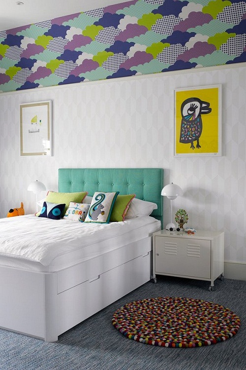
The photo shows a combination of three types of wallpaper in the interior of a children's room.
Photo in the interior of the rooms in the apartment
Living room
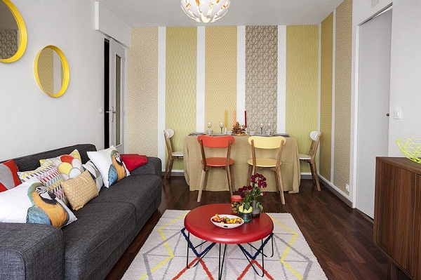
For the living room, there are a lot of ideas for decorating the walls. The material and pattern is chosen depending on the style. In a spacious room with corner sofa the reception of an accent wall looks harmonious. A beautiful pattern and rich colors will indicate a place of rest.
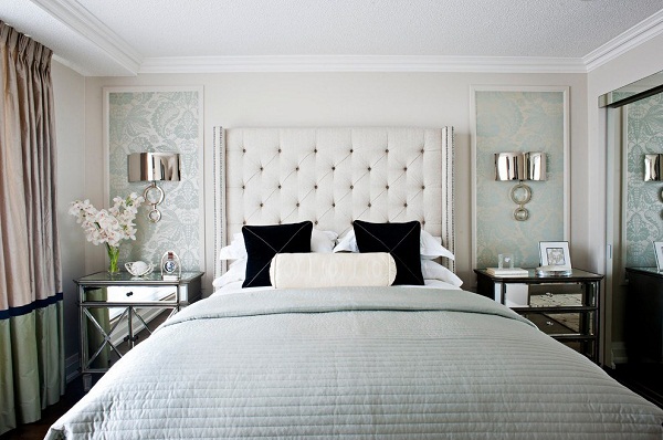
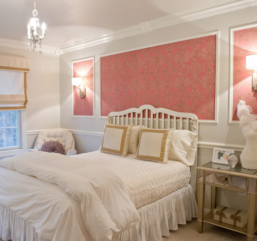
Bedroom
In the bedroom, as a rule, preference is given to calm shades. A combination of a calm shade of the main wallpaper and a photo wallpaper with a floral print at the head of the bed will look harmonious.
Kitchen
In the kitchen, it is more practical to combine wallpaper above the dining area and tiles in the cooking area. Colors may overlap.
The photo shows a horizontal combination of two types of wallpaper - plain and with a floral print, the joint is decorated with a white molding.
Children's
From the children's room, you can safely combine bright and juicy shades. For babies, you can use a patchwork technique with colors and patterns that match the gender. One of the walls finished with photo wallpaper or wallpaper with drawings will also look good.
Hallway and corridor
In a spacious or open hallway, you can combine simple, even and textured wallpapers with imitation of different materials.
The photo shows a practical combination of decorative panels with wallpaper.
Combination with other finishing materials
The combination of paint and wallpaper looks great in the bedroom. A smooth painted surface will be complemented by canvases with an ornament, a cage or an ornate pattern.
Combination with decorative stone
The combination of wallpaper with stone looks harmonious in the living room or hallway. Corners and part of the wall are trimmed with stone. The material can be both natural and artificial.
Combination with brick
Combining wallpaper and brickwork you can get a brutal loft style and gentle Provence. Depending on the color and decorative content, you will get a completely opposite design of the apartment.
In the photo, a combination of wallpaper with brick wall in the interior of the bedroom.
The combination of wallpaper and panels will become good option for finishing the hallway, living room or nursery. As a rule, the lower part of the wall is trimmed with panels using the horizontal combination method. The variety of choices allows you to make repairs in both classic style and modern.
Plaster
Combination for any part of the house. Plaster sets the main tone in the room, wallpaper is an accent element. The combination can be with plain wallpaper, wallpaper with a discreet pattern and photo wallpaper.
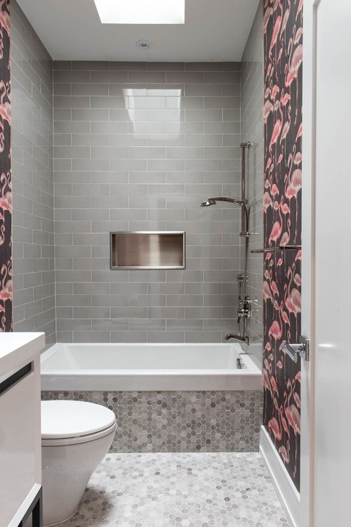
Tile
Combination for kitchen and bathroom. The working area and the zone of contact with water are tiled, the rest is provided with wallpaper. The combination can have a contrasting combination or have a common color and elements.
Hey! I continue a series of articles that inspired me to view ads for the sale of real estate on Avito when I chose us new apartment. I understand them typical mistakes in decoration, which I met literally in every second apartment. I already wrote about, the turn came to the wallpaper, namely the combination of different wallpapers in one room. And it seems that today there will be a mega post, because there is not just a lot of information, but a lot.
Lyrical introduction or where the problem grows legs
First of all, I want to note that, judging by what I saw, the combination of wallpapers is really a very popular technique in Izhevsk. And I think things are exactly the same in the entire post-Soviet space. I saved literally 80% of these photos, because about the same number of people use this method incorrectly. Something from the series: I saw this in the “housing problem”. Then I looked at the pictures on the Internet and did everything exactly the same. In fact, not exactly the same, but often quite the opposite.
I tried to figure out where the legs grow from. As usual, I googled the request “how to correctly combine wallpapers with each other in one room” (judging by the statistics, such requests in different options monthly recruit more than 10 thousand people (!!!) and looked at the top five sites in the search results. It’s just that usually no one looks further 🙂 And then a lot fell into place for me.
All articles are written by copywriters who are not at all interested in modern design and decoration, some sites of construction companies, repair companies. All information is rotten and of little use, and at times simply harmful.
Who are these designers? Where do they recommend it? Actually modern decoration allows for both. But in terms of the number of interiors, painted plain walls or plain wallpapers still lead by a wide margin, and not combinations.
The biggest difficulty is to understand that the combination must necessarily pursue some goal, practically program a person, make him look at the point you need, and not just not to be bored. This is not enough. If the goal is such, then it is almost guaranteed to get nonsense.
And now enough of the lyrics, it's time to sort through the archive of photos that I saved and show on their example the typical types of wallpaper mixes and the most common mistakes. Sit back, read, look carefully and learn from the mistakes of others.

Vertical arrangement of different wallpapers
This is the most common way at the moment. If you strongly generalize, then you can combine:
- patterned and plain,
- two types with different pattern
The first way is the most common. Programs about repair and design firmly instilled in the everyday life of our citizens the concept of an accent wall and zoning. But they never explained which wall to choose as an accent wall and on what basis, according to what criteria. It is on this wall that wallpaper with a pattern is glued, and on the rest - plain.
The main criterion by which you can determine whether it is worth focusing on it is its location. There must be sufficient distance to ensure good review. For example, in Khrushchev's kitchen Basically there is no place for it.
Usually they accent the wall against which the eye rests when entering the room. Or it may be located behind some functional area, a group of furniture, for example for dining table, a sofa with an armchair, a workplace that stands out even more against the background of suitable wallpapers.
Almost unmistakably, our parents determined it when they hung a carpet. Just imagine instead of a roll of wallpaper you have a chic antique Uzbek kilim. What wall would you hang it on? Will it be well seen from different viewpoints, will something argue with him for attention?
Example #1
In this accent living room (with flowers), it was worth making one wall for upholstered furniture, and the rest of the walls are plain (and preferably in the background color of the flowers). As a result, it is not clear what was singled out at all: either the wall behind the TV, or the end of the room with a window ... What was the idea? There is no idea, everything looks as if they took a couple of rolls left over from the last repair, since the main ones were not enough.
Badly

Example #2
Then the same error, what's the idea? "Carpet" in this case should hang over the sofa. It seems that the wall for the accent was chosen by tossing a coin, just from the bullshit. It is not clear why the person sitting on this sofa is asked to look at the left wall. And the colors themselves are well chosen.
Badly

Example #3
In the following example, I like the choice of color for the main wallpaper and the choice of the wall for the accent. Sufficient viewing distance that allows you to appreciate the view as a whole. But it is completely incomprehensible why the active wallpaper went further and settled above doorway. Because of this, the whole point of the accent wall was lost. If zoning was meant (corridor and living room), then why were they combined at all? Same error - no idea. Now it just seems that the corridor and the ball room have different finishes, the partition was demolished and everything was left as it was.
Badly

This implies another necessary condition.
It is necessary to correctly determine the boundaries of the accent wall. This is the whole wall, from corner to corner, and not some separate piece behind it and not several walls at the same time.
Example #4
The joints of the combined wallpaper should be in the corners, and not in the middle of the wall. Firstly, such a joint almost always looks unaesthetic or it seems that there simply wasn’t enough wallpaper.
No idea, sloppy joint.
Badly

Example #5
Why bother and glue up to the wall or was it really not enough?
Badly

Example #6
In the next photo, without a doubt, the wallpaper is deliberately pasted only in the center. This is a typical example of meaningless zoning, when repairs are made without understanding the future interior as a whole. I am 99% sure that a sofa or TV will be located along this wall.
This arrangement is a claim to symmetry, which severely limits the arrangement of furniture. By placing the sofa in the center of this composition, you can no longer move it a little to the left or right without re-gluing the wallpaper. Well, i.e. you can move, but you are provided with nonsense. Examples of the consequences of such pasting will be a little lower.
Badly

Example #7
Corridor in the same apartment. A claim to symmetry, but without the slightest understanding of how terrible it is in combination with unbalanced switches. What prevented you from choosing other wallpapers where they would not be so noticeable and sticking them all over this wall? After all, the wall itself is just perfect for an accent. Unsuccessful wallpaper, pasting with bits.
Badly

Example #8
Another arrangement of wallpaper with a stub above the sofa, which visually separates the sofa and armchair from each other. What is the idea? Focus on the entire wall, not on a piece of it, except if there are any constructive protrusions.
Badly

Example #9
The logical result of the cores on the wall. The sofa was moved, but the wallpaper remained.
Badly

Example #10
Something went wrong ... In connection with the addition to the family, I had to make a rearrangement. It is now impossible to catch the initial idea.
Badly

Example #11
It is impossible to predict in advance exactly to the centimeter how you will arrange your furniture if the interior is formed spontaneously. At least you need a strip of wallpaper, but it would be better to continue to the end of the wall so that the chairs and the table look like a single group.
By the way, cool, a table on one leg has not seen such for sale.
Badly

The patchwork technique itself is not so bad, but not in this form, of course.
Badly

Example #13
The idea "so as not to be bored" ruined more than one interior. In the nursery in the next photo, the parents bought the entire wallpaper collection at once: patterned, green and orange. And used in one room all at once. The wall for accent wallpaper with a pattern, in my opinion, is well chosen. But! What are the stripes for? Why bright orange behind the curtains, because the window itself is a self-sufficient architectural accent.
As a result, the gaze does not focus on one thing, wanders randomly, because everything is arguing with each other for attention. Enumerating the areas of active colors, the accent wall is lost. Not observed. It would be much better to combine instead of orange and green "companions" to take a neutral beige, which serves as a background for the picture.
Badly

Example #14
In general, companion wallpapers are evil. This is such an inconspicuous trap, it seems that if some designers at the factory made them compatible, then there can be no mistake. In fact, as it can, almost all examples of the use of these pairs are extremely unsuccessful.
For example, let's look at the combination of wallpaper in the next room. It is absolutely certain that they are companions. As for the compatibility of colors and patterns, I have no questions, everything is really good. But! Both types of wallpaper have a very active pattern, i.e. It is completely unclear which of them is the main one, and which is the additional one.
What would be nice when combining patterns of sofa cushions does not work at all with wallpaper. Looking at this interior again, the idea is completely incomprehensible, which wall is accent? Left, right, end? What are different wallpapers used for? Why do different wallpapers have equal surface areas?
As usual, the result of a senseless, thoughtless combination is a complete mess.
The situation is aggravated by the incorrect scale of the floral pattern, and already low ceilings seem lower than they really are. An extremely bad choice. If you missed the article on how to choose, be sure to read.
Everything is bad


Example #15
In the bedroom, the perfect place to accent is the wall behind the head of the bed. Remember carpet? That's where it should have been hung. Rarely, any other options are possible: the walls are of some irregular geometry, have ledges, the bed is in a niche, etc.
In this bedroom, the owners again fell into the trap of companions, bought a pair with drawings of the same activity and it was not clear what they wanted to highlight. The wall behind the bed? Then why did they take over the window? TV wall? This wall is not suitable for an accent.
And again, the terrible scale of colors, hiding the height of the ceilings. The link to the article about this error was just above.
Badly


Example #16
In order to clearly define the accent wall and make sense in wallpaper zoning, the drawings should be different in activity (in attracting attention to themselves)
Badly

Example #17
You should not use three types of wallpaper, as in the children's room in example No. 13, there is too much of everything. Zones, zones, zones, crushing already small space into pieces ... Only one wall should have been accented (either behind the bed or opposite the entrance at the table). Three types are overkill. And if there were 4 types of companions in the collection, would they buy everything, by the number of walls?
Badly


Horizontal arrangement of different wallpapers
Example #18
To date, this method is simply obsolete - this is a hello from the first renovations of the nineties. Then the first companions and paper borders appeared on sale. The hottest fashion. But today good contemporary examples such a combination of wallpaper simply does not exist. I named it so that the list was complete, for information. You will just know that it is there, but keep in mind that it is better not to use it for the next 50 years.
The horizontal line cuts the wall in two and hides the height of the ceiling.
Badly

Combining photo wallpaper with wallpaper
The combination of wallpaper with photo wallpaper deserves special attention. I noticed that with them, at first glance, things are somewhat better, at least the choice of the wall is almost always successful. But still there are some nuances.
Example #19
I like the choice for the accent wall: the right location at the end of the room, near the bed, there is enough distance in the room to appreciate the whole image, and not stare at it point-blank. I like the large size, from wall to wall, joints in the corners. It's all great and well done. But the very combination of photo wallpapers and a pattern on the rest of the walls looks bad. It would be much better if the second wallpaper was paintable or smooth plain white or sand.
Badly

Example #20
Exactly the same story. The right accent wall, the right size, but the absolute incompatibility with the main wallpaper. Moreover, the main ones are also quite interesting and not bad in themselves. They just shouldn't be together. We need one color here.
Badly

Example #21
Do I need to comment on this photo? It seems to me that you can see everything yourself: photo wallpapers running over the adjacent wall (what prevented you from trimming ???), a combination with striped wallpapers (monochrome ones are needed), and a closet that “allows you to enjoy” views of the night city.
Everything is very bad

By and large, to summarize, we can distinguish 3 main mistakes:
- lack of idea and meaning in combining wallpaper, action from the bulldozer;
- wrong choice of wall for accent;
- the use of wallpaper is not on the entire area of \u200b\u200bthe wall, the joints are not in the corners.
From here follow 5 simple rules, and if you take them into account, I think that you can easily combine beautiful wallpapers in your room. Learn from the mistakes of others, not your own!
- Accent wallpapers are placed on the view wall, there should be good viewpoints for it, the minimum distance from the viewpoint is 3-4 meters, and preferably more.
- Never use any ready-made companions if they are both with an active pattern.
- The best combination for photo wallpapers and others with an active dynamic pattern is plain wallpaper.
- Glue accent wallpaper on the entire wall, from corner to corner or other architectural elements (niche edges, ledges, etc.), then you don’t have to think about how to make a joint.
- Think about why you want to draw the eyes of those present to this wall, think over the idea.
Examples of the ideal use of combining wallpaper in decorating a room
The vast majority of examples are a combination of an active pattern with plain walls (plain wallpaper, wallpaper for painting, or just painted walls). If you are not mentally prepared for most of the plain walls in the room, then it’s better to think 10 more times about whether you need an accent wall in the interior at all.


Facing the walls of the hall with the same wallpaper is a thing of the past, giving way to stylish design solutions for decorating the space. Today, the focus is on combination - a design technique that allows you to beat any features of the room, advantageously emphasizing the desired area.

Which are suitable?
The combination technique allows the use of different types of finishes. Each material has its advantages, although it is not without its drawbacks.
The most popular of them include:
- paper- mostly two-layer, able to hold out on the walls for up to 5 years (the budget alternative, which is not very resistant to steam and moisture, looks simple);

- vinyl- elite roll finishing, capable of correcting wall irregularities, including canvases with a solid, smooth, porous structure and embossing, designed for up to 15 years of operation (harmful, as it releases formaldehyde vapor into the air);

- non-woven- elastic fabrics meter wide, distinguished by practicality, color fastness, resistance to accidental mechanical touches, durability, attractive texture, but attracting dust;

- textile– wallpapers with premium front side, which are great choice for the hall as an accent, made in the form of interwoven threads glued to a paper base and closely spaced textile fibers (a capricious finish in pasting, which is not resistant to moisture);

- liquid wallpaper– coatings in the form of a powder or a ready-mix, which, after facing, must be covered with a layer of acrylic varnish to increase practicality (ecological finish as an accent, demanding in choosing a companion, as it has a special volumetric texture);

- photo wallpaper- a classic combination technique, which is a paper-based wallpaper in the form of a solid accent pattern or a canvas with an image fit (their weak side which is the fear of ultraviolet radiation);

- glass wall paper- canvases made of fiberglass mass with shaping it by means of special impregnations. This is a wallpaper with original texture and good performance.

Advantages and disadvantages
It is no secret that each room has its own characteristics. The combination of two different materials of the same line is a non-standard solution for interior composition, through which you can perform a number of tasks. This technique involves a combination of plain wallpaper and canvas with a pattern in the lining. The uniqueness of the idea lies in the fact that the print can be made with paints, photo printing, embossing, it can also be presented in the form of an invoice.

The raw materials used for this decor are diverse: the materials on the market are full of beauty of shades, versatility of themes, extraordinary texture. Each type of cladding has its pros and cons, provides for a combination, differs in the richest colors and different performance characteristics.
By taking the combination, you can mask the unevenness of the walls, pasting the most practical companions in the right place, beating different possibilities of wallpaper (for example, using washing in places with an increased likelihood of contamination).

The design approach has a lot of advantages.
The combination of wallpaper of two types allows you to:
- to beat the design features of the room, deliberately emphasizing the ledges, niches, panels, turning the shortcomings of the area into bright accents style;
- muffle an overly bright and patterned companion through a calm contrast, saving the interior from an abundance of variegation and oppressive atmosphere;
- accentuate a favorable place in the room, thereby distracting from unsightly corners, emphasizing the uniqueness of the design;
- zone the room into certain functional areas, thereby introducing an unobtrusive organization into the space;

- reduce the consumption of material for adjusting the pattern, if necessary, using the remnants of canvases from neighboring rooms;
- give the room a personality, using beautiful examples of experienced interior designers, adjusting them to the features of the hall and your taste preferences;
- change the aesthetic perception of the room by infusing the desired shade, pattern, adding lighting and the desired temperature to the environment;
- combine together disparate pieces of existing furniture and other interior elements (curtains, poufs, decorative pillows, table lamps, floor lamps, Wall lights, paintings, etc.);

- choose your “color type”, thanks to which you can create the right mood and increase your potential, make the atmosphere of the room cozy at home;
- give the space the desired status by combining expensive and fashionable textures that match the pieces of furniture;
- depending on the shades used, their saturation and the size of the picture, create stylish interior in classical, ethnic or modern design, pointing to its idea;
- rid the space of boredom and routine, filling it with fresh colors.

The combination of wallpaper has a lot of design possibilities: modern manufacturers, knowing this technique, offer paired canvases for sale, not limited in subject matter. In addition, there are always wallpapers in any style on store shelves, be it classic flowers or creative abstraction.

If desired, you can always choose a combination, taking into account your own preferences and the budget planned for the purchase.
disadvantages
The combination of two types of wallpaper is not always harmonious. This may be due to several reasons.
One of them is the rule of texture compatibility: not all canvases, different in composition and appearance, can be mixed. For example, smooth paper wallpaper simplify the look of vinyl or embossed textile options.
They will not fit non-woven either: the finish should be selected taking into account the status of each type. To make the reception successful, it is worth beating it with the use of photo wallpapers.

Different width and relief matter. Porous thick wallpapers, combined with thin paper or smooth non-woven ones, do not create a feeling of solidity, therefore they look fragmented and resemble hastily glued remnants of the lining. Some canvases are difficult to pick up due to the lack of identical shades.
The method of combining two wallpapers has disadvantages:
- it does not always give the desired effect and expressiveness;
- inappropriate in small rooms, as when using large drawings it creates a feeling of congestion and limited space;
- does not look beautiful and stylish if made unprofessionally, thoughtlessly, without a pre-prepared sketch;

- requires a clear place for each piece of furniture, otherwise it loses its expressiveness;
- compares each element of the decor with itself, therefore it implies stylish furniture and does not accept unnecessary details that overload the overall look;
- far from always pulling out the adjustment of trapezoid rooms with a broken perspective, giving it an even more awkward look, visually warping the walls;
- often has an unsuccessful print in the form of a small strip, polka dots, cells that create ripples in the eyes, irritate just a few days after pasting.

How can you glue?
Methods for gluing wallpaper of two types are multifaceted. There are several original design techniques that are worth considering.
The size of the picture, the color of the paintings and the texture depend on the height of the ceiling. If it is low (2.5 m), the shades should be light, the pattern should be small, the texture should be soft. If the ceilings are low, it is preferable to combine using stripes or a canvas without a pronounced pattern with a plain coating.

With a high ceiling, a large print is harmonious, stretched wide or horizontal stripes.
The rules of pasting dictate the dimensions of the hall: the larger it is, the brighter the shade can be, the more expressive the pattern. If the room is narrow, you can combine with the entry of the canvas on a long wall. This will allow you to beat the shortcomings of the layout.
In cases where the entrance to the room falls on a narrow side, it is necessary to highlight the opposite wall in a contrasting color, beating the corners with wallpaper for short walls. Additionally, you can use special vinyl-based stickers: they perfectly correct layout flaws.

Use the techniques of combining experienced designers:
- horizontal- a stylish solution in which the wallpaper is glued parallel to the floor by using canvases with an original texture or alternating exclusively paired wallpapers with a smooth transition of the print;
- vertical- a classic technique that allows you to divide the walls vertically: highlighting the contrast in the form of two or three stripes of wallpaper with a pattern (maximum one wall) and smoothing the remaining planes with plain canvases;
- decorating walls with panel inserts- gluing the main plain wallpaper with the addition of small fragments of accent paintings framed in moldings or ceiling plinth;
- emphasizing ledges and niches- selection design features by gluing contrasts or smoothing them with plain companions.


How to avoid mistakes?
To avoid common mistakes, it is worth considering a few simple rules:
- if the space of the hall is small, exclude from the list of preferences wallpaper with a large print that does not correspond to reality (large decor elements have a pressing effect);
- exclude combination different styles: ethnic and modern, antiquity and technology, conservatism and abstraction (they cannot be combined into a duet);
- buy canvases at the same time, if possible, in natural light: this way you can check them for compatibility of tones;
- if there are no combining skills, it is better to buy a contrast with a pattern of several shades: it will be easier to choose a calm companion for it (it is better to buy photo wallpapers);

- do not combine by alternating strips of the same width: it is devoid of taste, splits the room into parts, gives the room the feeling of being in a gypsy tent;
- exclude diagonal reception: in most cases, this leads to a visual distortion of the wall;
- bright and hot colors irritate the psyche and provoke pain in the eyes, it is more expedient to dilute the bright contrast with a companion of the pastel group;
- the combination of a floral pattern with textural ornaments should be dosed: an abundance of contrast overloads the room and quickly gets bored;
- do not confuse brightness and tone: shades can be combined in tone, but the brightness of two companions is unacceptable, only one can dominate.

Meaning of use combined wallpaper is to make the room individual, beautiful and cozy. You do not need a lot of contrast and variegation: this is how the print loses its significance. The unity of style is achieved by moderation. A contrasting color is necessary to highlight the details of a pattern or a specific area of the hall. It is applied only on one wall or in one place of the plane.

It is extremely important that the room is designed in the same style, otherwise the acquisition of uniqueness is impossible, the combination is meaningless and will not have the desired effect.
From different materials
Create spectacular wall cladding different materials without a sense of imbalance is quite possible. It's extremely simple. If you have a sense of taste, you can combine different finishes, while it will look appropriate, cozy and fashionable.
To correctly and harmoniously combine two types of wallpaper, it is worth:
- select canvases of the same thickness (this will reduce the accentuation of the joints and make the vertical transitions of the canvases invisible);
- pay attention to texture: a glossy surface simplifies any canvas, so it is better to replace it with embossing, and a matte one often needs a similar companion support;
- pay attention to color: at least one of the contrasting shades of the two canvases should be common;

- understand the purpose of the room: it is inappropriate to glue wallpaper with funny children's drawings or the theme of the bathroom on the walls of the hall;
- decide on the dominant: the accent with the print should not be large;
- select contrasts deliberately: animal print is not combined with polka dots, stripes, zigzags, flowers.

Different sizes
In order for the combination to be harmonious, the sizes of the canvases must be different. The chosen technique is appropriate in one room, so the renovation will look unique and stylish. The combination of drawings of different sizes should be careful: this is only permissible in a spacious room. The print may be different, but large sizes are unacceptable on two canvases.


The modern approach allows the use of repeating colors through texture when pasting. It can be an animal print and wallpaper with a plush or velor texture, canvases with monograms and a companion with imitation of plaster stains, a mix of floral motifs and embossed stains in the form of curls. The main thing to understand is that two drawings often overload the room than fill it with the desired effect.

Color combinations
The main criteria for choosing a shade are psychology and color combination. To do this, you can refer to the color wheel, which will demonstrate the correct arrangement of contrasts.
It is important to remember: warm shades (beige, cream, peach) give comfort and a relaxing atmosphere, fresh tones (mint, blue, blue-green) can bring coldness and lethargy into the space.
Eliminate the abundance of blue and purple: they have a negative effect on the psyche, causing depression in the elderly. If you want freshness, you should look at the contrast of beige and turquoise tones. The abundance of orange, red is unacceptable.

Monochrome gamma can cause negativity: you need to combine black and white shades sparingly. It is more expedient to beat the contrast, using a gray pattern with a silver coating or embossing on a white background, supporting the atmosphere with furniture with black decor.
The embossing technique makes the room luxurious: made in coffee, lilac shades, it will look stylish if it is shaded by a solid companion without radiance. To tie two canvases together, you can stick stickers on calm wallpapers or hang pictures that match the color of the pattern with a bright print.

The best combinations are:
- green and beige;
- lilac and silver;
- olive and orange;
- lilac and fuchsia;


- sand and diluted turquoise;
- white, gray and silver;
- cocoa color with milk and pink;
- coffee, beige and gold.
